REVOLUTION SKIN
I don’t just design packaging — I build brands. For Revolution Skin, I transformed a single packaging brief into a full 360° brand vision. By researching trends and consumer needs, I refined the range into a simple 4-step routine and created bold, dopamine-hit packaging that speaks directly to Gen Z. From moodboards to campaign direction, I shaped a seamless brand experience across every platform.


BLUSH BURST
Blush Burst is all about energy, colour, and impact — and I led the design to make that vision real. From early ideation and moodboards to defining the creative direction, I built a packaging concept that bursts with vibrancy while staying true to Revolution’s playful, trend-led identity. The final design not only amplifies the product’s personality but also integrates seamlessly with the wider range.

SKIN SILK
I developed the concept and visual direction for the Skin Silk Under Eye Brightener, ensuring the packaging aligned seamlessly with the existing foundation design. While not bespoke, I took full ownership of refining and adapting the design from concept to print-ready files, creating a polished, cohesive look that strengthens the product range.
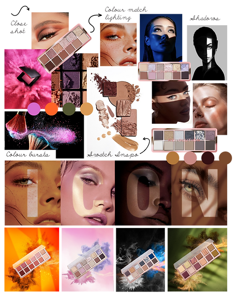
ICON PALETTES
I led the brand ideation for the Icon Palettes, focusing on delivering big bursts of vibrant color to reflect the colorful eyeshadow shades inside. We wanted the concept to feel bold and exciting while appealing to a wide audience. I executed the packaging design to be premium and visually striking, combining functionality with an aesthetic that truly represented the vibrant, high-quality product range.